


Wallpaper can influence the entire character of a room, from its colour palette to the choice of furniture and accessories. Brunschwig & Fils wallpaper is often selected for interiors where pattern, colour, and decorative detail play an important role.
If you are wondering, How Do You Match Brunschwig & Fils Wallpaper With Décor?, the key is to treat the wallpaper as part of the overall design rather than as an isolated feature. Furniture, curtains, rugs, lighting, and decorative items should relate to the wallpaper without making the room feel overly coordinated.
The following approach can help create a balanced and visually comfortable space.
Start With the Wallpaper Pattern
Before choosing furniture or accessories, examine the wallpaper carefully. Look at its dominant colour, secondary shades, pattern size, and overall visual weight.
A wallpaper with a large botanical or geometric pattern may naturally become the main visual element in the room. In this case, surrounding furniture and accessories can be simpler.
Smaller or more subtle wallpaper patterns provide greater flexibility and can usually be combined with more detailed upholstery, rugs, or decorative objects.
Identify the Dominant Colours
Select two or three colours from the wallpaper that can guide the rest of the room.
The main background colour can influence larger pieces such as sofas, curtains, or rugs. Secondary colours can then appear in smaller details such as cushions, lamps, artwork, or decorative accessories.
There is no need to match every colour exactly. Slight variations can make the interior appear more natural.
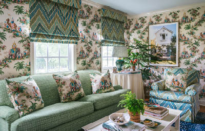
Balance Pattern With Plain Surfaces
One of the most important considerations when matching patterned wallpaper with décor is visual balance.
If the wallpaper has a detailed print, using too many additional patterns can make the room appear crowded. Plain furniture, simple curtains, and restrained accessories can provide visual relief.
For example, a detailed floral wallpaper can be paired with a solid-colour sofa and cushions that repeat one or two colours from the wall.
If the wallpaper is subtle, additional patterns can be introduced through upholstery, curtains, cushions, or rugs.
Mix Patterns Carefully
Different patterns can work together when they vary in scale.
A large wallpaper motif can be combined with a smaller stripe, check, or simple geometric pattern. Avoid combining several patterns of similar size because they may compete for attention.
Keeping a consistent colour connection between patterns also helps create a more unified appearance.
Coordinate Furniture With the Wallpaper
Furniture should complement the wallpaper without disappearing into it or competing with it.
Traditional wallpaper patterns may work naturally with classic furniture shapes, while simpler designs may suit contemporary furniture. However, mixing periods can also create an interesting interior when colours and proportions are carefully considered.
Wood furniture can introduce warmth and contrast against patterned walls. Light wood can soften darker wallpaper, while deeper wood tones may complement warm or richly coloured designs.
Upholstered furniture provides another opportunity to connect the wallpaper with the rest of the room.
Choose Curtains That Support the Design
Curtains occupy a significant amount of visual space, so their colour and pattern can strongly affect how the wallpaper appears.
Solid curtains are often the easiest choice with detailed wallpaper. Select a shade taken from the wallpaper or choose a neutral colour that allows the wall pattern to remain prominent.
Patterned curtains can also work, particularly when the wallpaper and fabric share similar colours.
Consider the Amount of Natural Light
Lighting changes the way colours appear throughout the day.
Rooms with plenty of natural light can usually accommodate deeper colours and stronger patterns. In darker rooms, lighter fabrics, pale furniture, and reflective surfaces may help balance richly coloured wallpaper.
It is useful to view wallpaper and fabric samples together in the actual room before making a final decision.
Match Rugs With the Overall Colour Palette
A rug can connect furniture, wallpaper, and flooring while defining the seating area.
When the wallpaper is highly decorative, a simple rug may provide the right balance. Neutral shades, muted colours, or lightly textured designs can work well.
If the wallpaper is understated, a patterned rug can add another decorative layer.
Rather than matching the wallpaper directly, choose a rug that shares one or two colours with the broader room palette.
Use Accessories to Repeat Key Colours
Accessories allow colours from the wallpaper to appear elsewhere without dominating the space.
Cushions, throws, ceramics, lampshades, artwork, and decorative objects can repeat selected colours from the walls.
For instance, if the wallpaper contains green, cream, and muted red, these shades can be distributed across different accessories instead of using all three colours on every item.
This creates continuity while keeping the room visually varied.
Keep the Room From Feeling Overdecorated
When learning How Do You Match Brunschwig & Fils Wallpaper With Décor?, it is important to consider what should remain simple.
A room does not need patterned wallpaper, patterned curtains, patterned upholstery, and a detailed rug at the same time.
Choose one or two major decorative elements and allow the remaining surfaces to support them. Neutral areas give the eye somewhere to rest and can make detailed patterns easier to appreciate.
Consider the Style of the Entire Room
The wallpaper should relate to the purpose and atmosphere of the space.
Bedrooms may benefit from softer colours and fewer contrasting patterns, while dining rooms or sitting rooms can often accommodate more decorative detail.
In hallways or smaller rooms, wallpaper can become a strong design feature because there may be fewer pieces of furniture competing with it.
Consider the room as a complete composition rather than choosing each item independently.
Test Samples Before Finalising the Décor
Colours and patterns can look different on a screen, in a showroom, and inside your home.
Place wallpaper samples beside fabric, paint, flooring, and furniture samples. Observe them during both daylight and evening lighting.
This simple step can help identify colour clashes, differences in undertone, or patterns that feel too strong when viewed together.
Final Thoughts
Matching Brunschwig & Fils wallpaper with décor is mainly about controlling colour, pattern, scale, and visual balance. Begin with the wallpaper, identify its main colours, and use those shades as a guide for furniture, fabrics, rugs, and accessories.
Detailed wallpaper generally works well with simpler surrounding elements, while understated designs offer greater freedom to introduce additional patterns. By repeating colours selectively and leaving enough plain surfaces in the room, you can create an interior that feels coordinated without appearing overly matched.